The Graphic Designer’s Guide to Mastering Color Theory in 2025

Graphic design blogs have increasingly shifted their focus from static color wheels to adaptive systems and accessibility mandates. This analysis reviews the current landscape as practitioners prepare for the year ahead, drawing on industry discussions rather than individual case studies.
Recent Trends in Color Theory Application
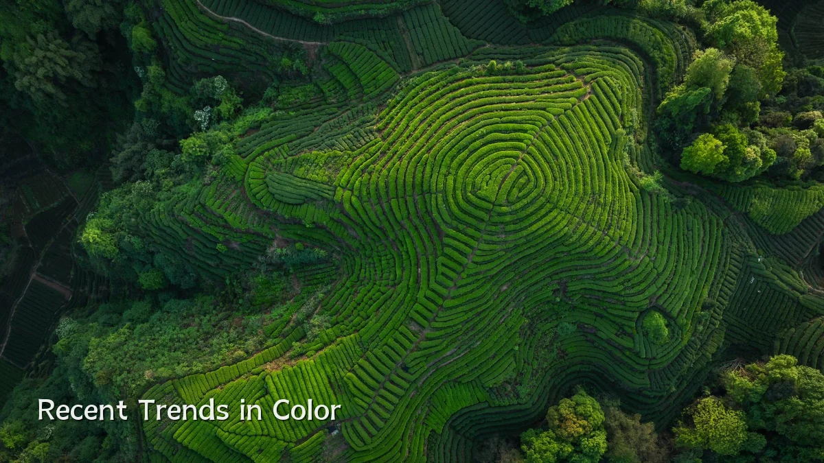
- Accessibility-first palettes – Contrast ratios and color-perception simulations are moving from optional to standard practice in many studios, driven by broader compliance requirements.
- Dynamic color systems – Designs now rely on variables that adjust hue and saturation based on context (light/dark mode, user preferences) rather than fixed hex values.
- AI-assisted palette generation – Machine-learning tools propose harmonious schemes based on intent descriptions, but designers still curate and validate for brand fit.
- Sustainability-linked palettes – Some blogs note a trend toward muted, natural tones as brands align visual identity with environmental messaging.
Background: Why Color Theory Remains Core
Color theory has long shaped visual hierarchy, emotion, and readability. While digital tools have evolved from print-centric CMYK models to sRGB and wider gamuts, the underlying principles of hue, saturation, and value remain constant. The shift in 2024–2025 involves how these principles are applied across varied devices and viewing conditions, not whether they matter.

User Concerns: Common Pitfalls and Practical Questions
- Brand consistency across media – Designers worry that a palette that works on a calibrated monitor may shift on a mobile screen or in ambient light. Calibration workflows and relative color spaces are frequent discussion points.
- Color vision deficiency considerations – About 8% of male users experience some form of color blindness. Blogs emphasize checking palettes with filters, not just relying on contrast alone.
- Cultural and contextual meaning – A color that signals trust in one market may imply mourning or caution in another. Global campaigns require regional palette reviews.
- Tool fragmentation – Designers name the lack of a universal color-management system across apps as a recurring friction point.
Likely Impact on Design Workflows
Expect more design teams to embed color-contrast checkers and perceptual-simulation plug‑ins directly into their editing environments. Automated suggestions will reduce initial palette browsing time, but human judgment will remain critical for brand story and emotional nuance. Agencies and freelancers who adopt structured testing methods early may see fewer revision cycles in client deliverables.
What to Watch Next
- Real-time color testing – Browser-based prototypes that simulate ambient lighting and different display types could become standard review tools.
- Community-driven resources – Graphic design blogs are likely to publish case studies comparing palette generation methods, with benchmark-like guidelines rather than absolute rules.
- Integration of color theory into AI training data – As models learn from existing work, blogs will examine whether they perpetuate legacy biases in color use (e.g., gender‑linked hues).
- Educational shifts – Courses may emphasize context-aware color design over static rules, pairing classic theory with modern accessibility standards.